Readability improvement
Hello!
I've uploaded a new version 1.3 that improves readability and some other stuffs.
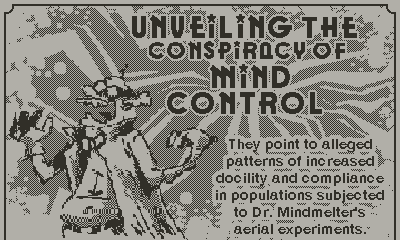
1️⃣First I've added a larger white border on texts having a background. Take a look at the lead paragraph under the title. It's slightly better on the second image! Right?


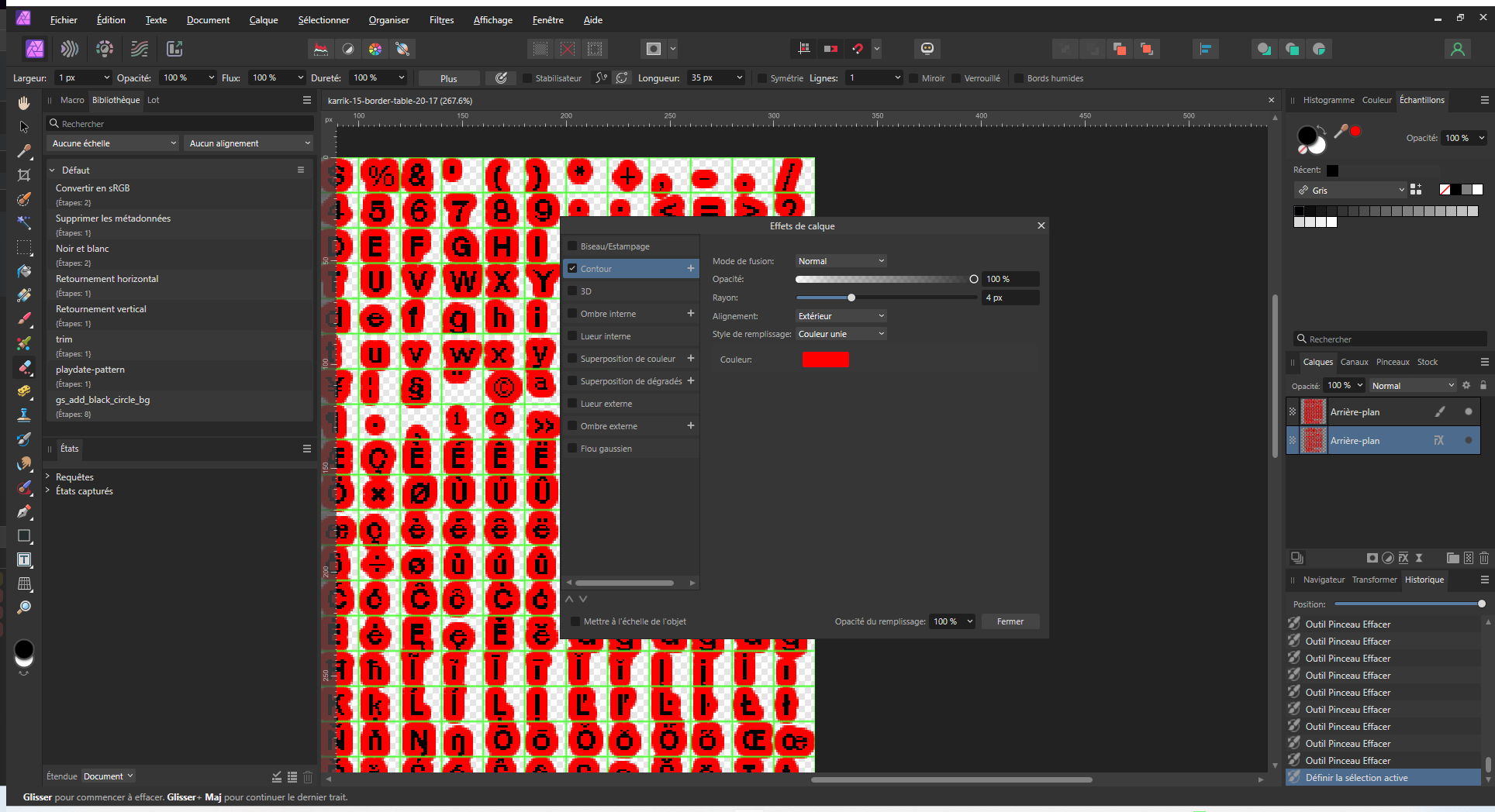
If you are a Playdate developer or just interested, here is my technique to add a 4px text border on the Playdate.
- Duplicate the font you use
- Move 4px to the right the image
- Add a 4px border

- Erase borders dripping on other character, you can use a grid for that (look at the g, I have erased the part below the green horizontal line, if I don't do that, there will be a weird border when displaying the w).
- Draw with the Playdate sdk the "font border" 4px to the left in white before the real font in black
Of course, there is probably a cleaner way to do that, but it's pretty quick.
2️⃣Then I've enlarged the clue panel to have more padding between the border and the text, it should be noticable on longer texts, especially in french.
3️⃣Furthermore I've made the clues punctuation more consistent.
4️⃣And finally, I've added a message to warn you when the last clue is reached in a puzzle so you can stop looping🛑📜 (which allows you to avoid losing points needlessly if you try to make a big score).
As I move forward on an other game, I learn a lot on making Playdate games better. I'd love to have a better framerate. So see you soon!
Files
Get The Scrolling Enigma
The Scrolling Enigma
A short narrative puzzle game about...game development!
More posts
- Achievements and secret ad39 days ago
- Version 1.5.0 release: enhanced clarity!Jun 13, 2024
- Press coverageMay 24, 2024
- Catalog release and small fixMar 28, 2024
- Smoother ExperienceMar 24, 2024
- Playdate update showcaseMar 03, 2024
- First bug fixDec 28, 2023

Leave a comment
Log in with itch.io to leave a comment.